
Today’s card evolved from the Sketch Challenge over at the Fab Friday Challenge Blog.

There’s always something about a sketch that catches my eye. The rest of my project usually morphs into something not intended. That’s the case with today’s post. When I saw this Fab Friday sketch, my eye went directly to the banners. I thought they were interesting.

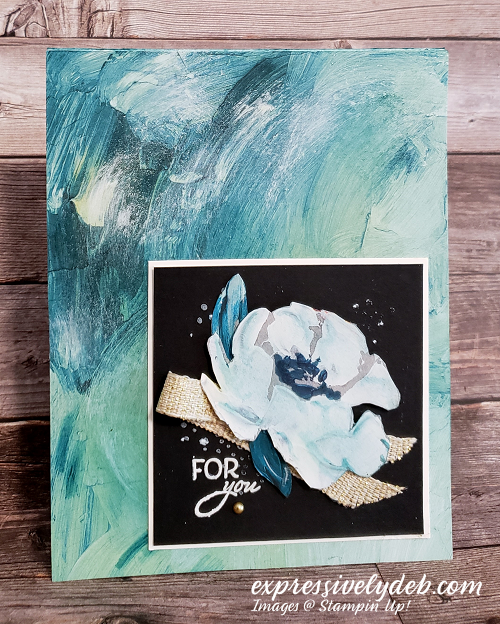
I wanted to cover the front of the card (no layers today), and went with the brush stroke watercolor pattern from the Fine Art Floral Designer Series Paper. It’s been a while since I looked at the patterns and they are certainly stunning. I wish I could say I created the paper, but I didn’t.
I did sponge some white ink to the top left of the paper for color balance. The white flower is fussy cut from the reverse side of the background paper. I sponged a little Pretty Peacock lightly over the flower to give it some depth and again, to create a bit of color balance. I also added a little more Pretty Peacock ink to the background paper. The whole “inking” process was fun. I felt like a real artist!!
I ask myself, “what’s a Basic Black background without some white splatter”. You always need the white splatter on Basic Black, so I went to my favorite ink splatter stamp then added a few bolder dots with my White Chalk Marker.

I found the perfectly sized sentiment in the Friends Are Like Seashells stamp set. I stamped the sentiment several times with White Craft Ink and my Stamparatus.
The thought of adding cardstock banners came to mind, but I went with the Fine Art Ribbon instead.
This design doesn’t need embellishments, but I couldn’t resist adding the Gold Metallic Pearl.
So, pull out some gorgeous patterned paper, channel the artist in you, sponge some ink, add some splatter and create some “Fine Art”.
…the only limitation is your imagination!

For details on the products I used today, click on the images below.


Wowza! This is fabulous! Very striking!
Thank you, LeAnne.
Very different. I haven’t been able to come up with a way to use that paper. Putting the dark square on it helps to focus on the flower and sentiment. Love it!
Hi Barb. Thank you!
So great to see you here Debbie! I love how you showed off what this DSP can do! The background speaks for itself and the way you showed off the blossom on the Basic Black is stunning. It looks like it is hanging in an art gallery! The ribbon treatment is perfect for the sketch detail! Thanks for sharing at Fab Friday!
Hi Amanda. Thank you! I had so much fun inking that DSP which is just so beautiful by itself.
Love this Debbie – such a beautiful way to use these amazing papers.
Thank you, Joanne.
So pretty! Love the black panel under the flower, perfect! Thanks for joining us at Fab Friday, hope to see you again soon!
Thank you much, Amy. This was a fun sketch to create with.
This is gorgeous, Debbie! The added white really does add something special to this backdrop. Your flower is a stunner!
Thank you, Brian. This paper is amazing!