I can't tell you how excited I am to be showcased on Mary Fish's Stampin' Pretty Blog today. Because this is so special to me, I wanted to make today's post special.
I didn't start with a picture as I normally do because today is the beginning of a series of posts throughout this week that I'll be both talking about and illustrating some basic card design tips. There are not one, not two, but four cards for you today, so sit back and I hope you enjoy.
The Neutral
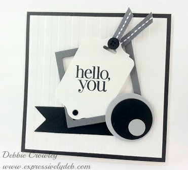
Let's get right to it. Today is all about creating with color, however my showcased card really has no color and yet contains every color imaginable. I'm not getting nutty or anything like that. It's a fact! White is the absence of all color and Black contains all color.
Black, white, gray and brown are all neutral colors and work with anything, so this card is Neutral and the colors convey a neutral mood. It can be masculine or feminine. No real statement or a big statement. It's mysterious (black) and simple (white).
What if I took away the black circle in the bottom right corner and replaced it with a bright Yellow circle… changed nothing else, but added the Yellow. Wow! The entire mood of the card would change. It wouldn't be neutral any longer. It would convey a totally different message… possibly bolder and friendlier.
WHEN IN DOUBT, ADD YELLOW… IT WILL ALWAYS WORK WELL AS AN ACCENT COLOR…
So let's try taking the same card, the same layout, the same sentiment, the same embellishments and LET'S CHANGE ONLY THE COLORS…It'll change the mood and the subjective message of the card. Play along, it's fun!
Pay attention to how you feel when you look at the different color combinations. I would love to hear your thoughts.
The Subtle (Soft)
This card features Stampin' Up!'s "Subtle" color pallette – Wild Wasabi, Pink Pirouette and So Saffron. This card is friendly, sweet, feminine, calming and simple (lots of white space). So Saffron (yellow) is the accent color. The message conveyed here is very different from the neutral card above, but the design is identical. The color changes the mood and message.
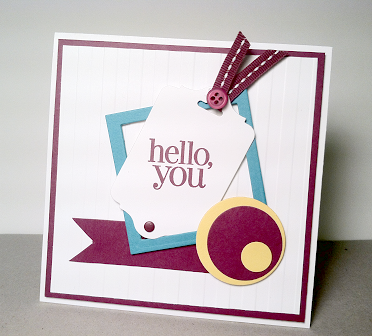
The Bright (Bold)
This card features Stampin' Up!'s "Brights" color pallette – Rich Razzleberry, Bermuda Bay and Daffodil Delight. This one's fun, cheery, friendly, more feminine than masculine, but could be either, and simple (lots of white space). Daffodil Delight (Yellow) is the accent color. A very different message and mood in this card than in the one above. Did your mood change a little?
The Regal (Rich)
And finally, Stampin' Up!'s "Regals" color pallette – Night of Navy, Island Indigo and Crushed Curry. This one has impact. It's cheery, and vibrant; more masculine than feminine, but could be both. The color intensity is high, creating a depth and richness, but it's relaxed and simple (lots of white space). Crushed Curry (Yellow) is the accent color. What are you feeling with this one?
Color is a real science and there's tons of information on the subject. One blog post a day for a year wouldn't tell us everything about color. Color is also very subjective and personal. We all have our favorites.
Understanding some basic color principles can help us all make good color decisions for our cards and projects.
Stampin' Up! has done most of that for us and given us beautiful color pallettes to work with that suit every mood and event.
Each of Stampin' Up!'s color suites is designed to coordinate perfectly with each other. For example for a "subtle" card – any of the colors in the Subtles Collection would work well with any other color in the Subtles Collection plus a neutral and possibly a "yellow" accent. Remember…yellow isn't necessary, but will always work.
So the formula for a perfect color combination is – A Subtle (or bright, or regal) with a Neutral plus an accent will always be a winner, or…
Two Subtles (or brights, or regals) with a Neutral plus an accent will always be a winner.
and with Neutrals…well, anything's possible!
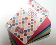
For even more color fun, inspiration, and information, try working with Stampin' Up!'s Color Coach. I use it often and am always pleased with the result.
Thanks for stopping by, and thank you, Mary, for showcasing my card as your Pals Guest Stamper today. It's great fun to be a Stampin' Pretty Pal!
Please stop by for tomorrow's post where I'll talk about "Layout".
I sure hope you enjoyed today's post.


![6a017744af3aa5970d019b00413721970b-500wi[1] 6a017744af3aa5970d019b00413721970b-500wi[1]](https://expressivelydeb.com/wp-content/uploads/2013/10/6a017744af3aa5970d019b005a9086970c-500wi.png)


Hi Debbie,
I came over from Mary’s blog – very cool post today! I was about to correct you, and say that white is actually ALL colors and black is the absence of color, but then I found this website: http://www.colormatters.com/color-and-design/are-black-and-white-colors#Anchor-Color-11481 which confirms that both theories have credibility!
I’m not sure why, but I like the Regals version the best. I think the colors complement each other best in that one. 🙂
~Janet
Good Morning! This is fantastic! a BIG woot-woot to you! Love everything about your post and blog! For sure…considered this CASED! Super card and love all of the color combinations! Thanks for inspiring me this morning!
Love it, very creative and unique.
What a striking design (all color combos) as well as classic layout! Thank you for being my Pals Guest Stamper, Debbie. I’m so proud to have you (and your awesome talent) as part of the group!
Love the neutral palette the best! Like Mary said, very crisp and cool. I think the design is so modern – just loved this card!!
SERIOUSLY LOVE your card Debbie. SO GLAD I stopped over from Mary’s blog……LOVE seeing all the colored examples you made. Nicely done friend!
Debbie – I love them all, but that Subtles card blows my mind! Love the layout of these cards and all the discussion. Very helpful! I read your blog every day, so I will definitely be here for your other tutorials.
Oh WOW…this was a delight to read and see the examples . I am like Brian there was something compelling about the Subtles mixed with your modern card style !
I came visiting at Mary`s suggestion and I am so glad that I did ! I will be visiting you often because this was fun !!
So pretty-all of them! I don’t have the patience to make the same card more than once so you have shown me how different they can look by just changing the colors. Great job!
I adore your study in color! What a great idea that can be done with any card. Thanks, Debbie!!
Deb, what a fun post for you to put together as Mary’s guest stamper. I really enjoyed your discussion of color and since I already subscribe, I know I will be following this week’s color study. My favorite was the Neutrals for most of the same comments… crisp and modern! Great job, Jersey girl!!
I have visited before and wish I did more often! This post is fantastic! I am so glad I clicked over from Mary’s blog. This was not only interesting but fun! I tend to use more of the regals but today the subtles just gave me the warm fuzzy feeling. I love the black and white version though. Great layout too. I think I had better sign up so I can continue to be educated in a fun way!
Hi Janet. Thanks so much for visiting today and posting “Colormatters”. It’s a good site for Color Theory. Glad you enjoyed the post!
Thank you, my friend, and you know you can always CASE from here. Hope all is well.
Happy and always proud to be a Pal, Mary. A big thank you to you!
Brian, thanks so much. I so enjoyed preparing this post and making the cards. I’m kind of torn between the Brights and Subtles. Love that Rich Razzleberry! Thanks, my friend.
Thank you Sonny. Glad you enjoyed this. I had fun writing it and even more fun playing with the colors while making the cards. Please do come back. Debbie
Thank you Debbie. Once you start playing with all the beautiful colors, it’s exciting to see how the next one will look. I agree with you, hard to pick just one favorite. Thank you again for visiting.
Thank you, Patti. Glad you enjoyed it.
Thanks Katy! I really enjoyed preparing for this. So fun to “play” with all the colors…this Jersey girl can’t wait to get back to Atlanta to see y’all!
Thanks so much, Chris. The Subtles seems to be very popular. Glad you enjoyed this as much as I did preparing for it. Our card making experience should be fun…thanks for noticing that! Debbie
Thank you, Sue.
Hello Debbie: Sheeesh!! I’m late coming here, I had a very busy weekend, with my grandkids here, my grandson’s championship football game, (which they won!!!!!)They all spent all Saturday and almost all Sunday but I didn’t want to wait any longer to tell you that I enjoyed this post so much, I came from Mary’s post and I’m so glad she suggested it. I love all the color combinations but my favorite is the one with The Neutrals. It’s so simple yet striking and elegant. Thank you for this study in color and layout, it was very, very educational and fun.