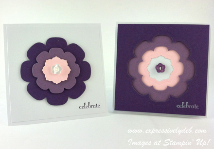
Okay, I'll give it up here…I've been paying more attention to "color".
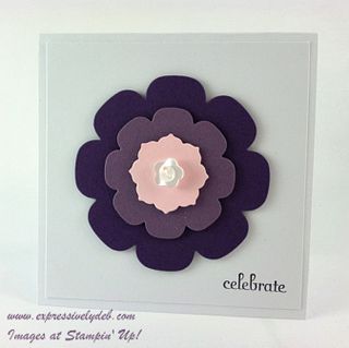
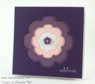
If you remember a few posts back, I talked about color saturation. In these cards, the three colors blend beautifully. The intensity or saturation of the purples is similar and is offset by the softer pink tone. The colors are soft, deep and strong and they work brilliantly with each other. These are Elegant Eggplant, Perfect Plum and Pink Pirouette.
I cropped my "Positive" and "Negative" flowers using the Floral Frames Framelits. There was no waste of card stock, here.
I'm showcasing these today, but these 4 1/4" square cards are one of the projects for my Stamp Camp on Friday. We're going to have fun with framelits!
I'll be sure to post a quick tutorial with some pictures of our Friday night creations. Check back on Saturday for the how to.
![6a017744af3aa5970d017c38839a21970b-500wi[1] 6a017744af3aa5970d017c38839a21970b-500wi[1]](https://expressivelydeb.com/wp-content/uploads/2013/04/6a017744af3aa5970d017d43094db8970c-500wi.png)
Stampin' Up! Supplies Used: Cardstock – Whisper White, Elegant Eggplant, Perfect Plum and Pink Pirouette. Stamp Set – Frbulous Phrases. Ink – White Staz on. Tools – Floral Frame Framelits and Big Shot. Embellishments – Subtles and Neutrals Designer Buttons.
CLICK HERE TO SHOP MY ONLINE STORE AT STAPIN' UP!


Very nice. I like this idea to not waste paper 🙂 Thanks for the idea