Sep 17, 2020 | Design Tips, Gallery, Quick & Easy, Thinking of You |

Happy Thursday!
Only those who know me best know that I love coffee. I’ve been known to indulge in a mocha latte or two, or three! So, I decided to celebrate my love of a good cup of coffee in today’s post.
Yesterday was another nice day, so I spent a little time outside sketching prospective projects for blog posts. This card was the first one I sketched. I don’t think it would be horrible to share my sketch with you. Keep in mind that my pencil moved really fast, so it’s not very neat. I hope you can see it. Don’t you just love my coffee cups?


I stayed with the Warm Hugs stamp set and the overall design, but switched to Gilded Autumn Specialty DSP rather than Heartwarming Hugs DSP changing my color palette completely. The sentiment stayed the same, but I stamped three coffee cups on the card, not five. Also, I was only going to have steam coming from one coffee cup, not all. I think I was thinking that the steam in the center cup might give this card a very unique design element. I’m not sure what I was thinking, but I like the three cups, all with steam!

I know we have our personal way of creating. Most of the time, I look at a piece of patterned paper, a sketch (not my own), a particular stamp set or die, or a color combination and know what I want to do with it. There are those times though, when the catalog inspires me or a Pinterest post or another blog post. Today, I was inspired by my own pencil and graph paper sketch which I CASED from the Warm Hugs Bundle.
So, wherever you find your inspiration, keep creating beautiful projects.
The only limitation is your imagination!


Oct 9, 2017 | Design Tips, Gallery, Halloween |
I was in Atlanta this past weekend celebrating World Card Making Day at a wonderful event hosted by two special stamping friends, Brian King and Pam Morris. It was obvious they worked tirelessly to make the day fun and inspiring for all of us.
I would like to extend a special thank you to Brian and Pam for inviting me to participate in the event as a presenter. I was excited and honored (not to mention a bit nervous) to be included among such talented Stampin’ Up! Demonstrators as Julie DiMatteo, Donna Griffith, Jennifer Beatty Hill, Pam, and Brian.
I enjoy CASEing beautiful cards and I really, really enjoy creating original cards, especially simple collage cards. Back in 2013, I posted a series of “Design Tips” blog posts which included a post on the “Design Rule of Thirds”. Brian asked that I present a little something to the group about the “Rule of Thirds” for a simple collage card. Below is the finished product and please pardon the grid paper background.

- If you want to experiment with the design “rule of thirds” it’s easiest to make yourself a “rule of thirds” grid. I made this one using one of Stampin’ Up!’s Clear Envelopes.
- The envelope size is 5 3/4″ X 4 3/8″. I trimmed the envelope to a standard A-2 card size 5 1/2″ X 4 1/4″ and with a fine tip Sharpie, I created the grid.
- The measurements for the grid lines are 1 7/16″ from each side, and 1 7/8″ from the top edge and the bottom edge.
- I also cut a piece of Whisper White card stock (A-2) to slip into the grid when I’m working with a layer. You can make a Basic Black one if you’re working with a light or white card layer.
- The grid is divided into three even sections horizontally and three even sections vertically.
- The grid illustrates the “rule of thirds” for a card layout.
- You can create a custom grid for any size card.

- Once I started placing all my card elements together, I used the grid to be sure the elements were where I wanted them to be and they were evenly centered for a “balanced” design.
- The pictures below illustrate how I put the card together using my grid.


You can take a look at my original post here.
Using this grid is a preference of mine and I have fun experimenting with it. I hope you enjoy using it, too!
Mar 15, 2017 | Birthday, Congratulations, Design Tips, Gallery |
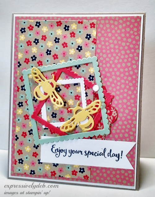
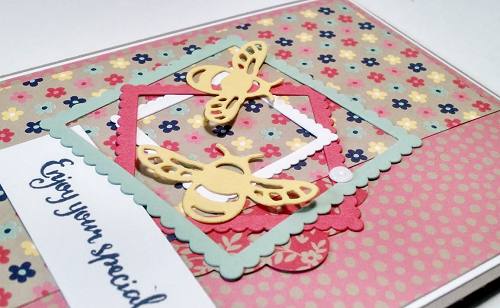
Aren’t these bumble bees adorable? They’re easy as one, two, three… with Stampin’ Up!’s Dragonfly Dreams Thinlits Dies and your Big Shot!
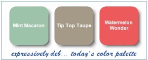
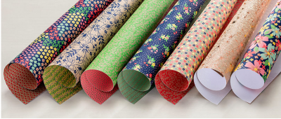
I’m spending the week going through all those sticky tabs I put on my 2016-2017 Annual Catalog last year. Today’s card showcases the pretty “Affectionately Yours Specialty Designer Series Paper”. This paper pack is fun and colorful. It features a few of the soon to retire “2015-2017 In Colors”, Mint Macaron, Tip Top Taupe and Watermelon Wonder.
Here’s today’s “How To”:
- I started with a Tip Top Taupe A-2 card base and added a thin Whisper White layer.
- My third layer (4″ X 5 1/4″) is the random dot pattern from the Affectionately Yours DSP.
- The Floral layer measures 2 1/2″ X 5″‘.
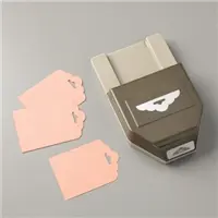
- With my Scalloped Tag Topper Punch, I punched a quick tag to display more of the patterned paper and to give my design a little more of a “collage” look. You can see that piece sticking out of the right side of the floral layer.
- I gave my Big Shot a work out using my Layering Squares Framelits… easy, easy, easy to crop.
- My Big Shot cropped two bumble bees from the Detailed Dragonfly Thinlits.
- I hand cropped a sentiment banner using one of the sentiments from the Dragonfly Dreams stamp set with Night of Navy ink.
Design Tips:
- My color inspiration came from the patterned paper.
- The “focal point” (center collage) includes my sentiment banner, which is typical. Usually a sentiment is included in the focal point of a card design, or the sentiment IS the focal point.
- I followed the typical design “rule of thirds” repeatedly in this card. There are three layered squares, three embellishments (two bumble bees and a White Perfect Accent dot), and three different paper patterns.
- The design is balanced since the “weight” of the design is in the collage near the center of the card and is anchored by the floral strip and sentiment banner.
- The color white balances the colors from the first card layer to the top Perfect Accent dot. White flows from bottom to top holding all the colors together. It’s a great neutral.
So, pick out your favorite patterned paper, crop a few cool shapes, embellish, balance and create something fun and colorful!
There’s til time to take advantage of Sale-A-Bration. Order the Layering Squares Framelits below, add the 2015-2017 card stock pack and coordinating Affectionately Yours DSP and you can pick out a free stamp set from either of the Sale-A-Bration brochures found in my online store by clicking the link below.
Nov 7, 2016 | Birthday, Congratulations, Design Tips, Gallery |
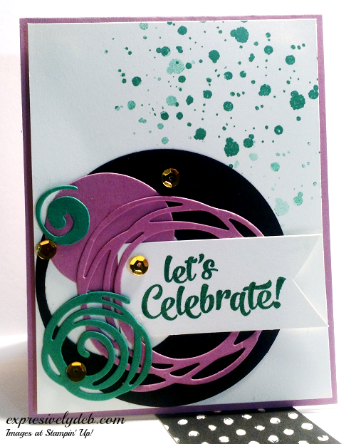
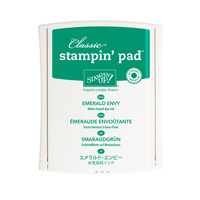
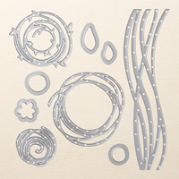
Today, I thought I would check in on the Global Design Project’s Challenge Blog to see what I’ve been missing and saw today’s Color Challenge. The colors immediately inspired me to go to the “Swirly Scribbles Thinlits Dies and just have some fun. Emerald Envy, Sweet Sugarplum and Basic Black: This combination is bright and cheerful and I immediately thought I should celebrate something. So, I’ll celebrate the Design Team… Thank you, Design Team!

Design Tips: Color Balance and Pattern Repeat
- The large Basic Black circle (my focal point anchor, inspired by the swirls) on the Very Vanilla card layer was a perfect start. Both colors are neutral.
- I punched a 1 3/4″ circle into the side of the large cropped circle for dimension and to also bring the color balance through to the focal point. There would have been too much black on the left side of the design. The thin black edge the punched circle created gives balance to the cropped swirly scribbles because it repeats the pattern.
- The largest Sweet Sugarplum swirly is balanced by the Sweet Sugarplum card base as is the solid Sweet Sugarplum circle (which is the center of the cropped swirly). It’s always fun to use those left over pieces, isn’t it?
- The smaller Emerald Envy swirlys certainly add the fun to this design, but I had to balance them with some Emerald Envy ink splatters. The ink splatters not only help balance the smaller swirlys, they balance that color as well.
- Lots of “pattern repeat” helps pull the design together…. circles and swirlys everywhere… even the sentiment font is “round”!
- A little bit of “bling” adds excitement to the swirly fun.
Note: When ever you have a lot of “pattern repeat” a design will most always work. As most of you know, I recently moved into a new home and decided I was going to start with a “clean slate”. I moved in with very little and purchased most everything new. I had fun with the shopping and decorating process and realized I applied much of my card designing skills to creating my new space… neutrals with pops of bold color and lots of pattern repeat, and of course, I had to add the “bling”. It works!

So grab some swirly shapes, splatter some ink, add a little bling and create something fun!

All the products for this project are from Stampin’ Up!’s 2016-2017 Annual Catalog.
Oct 2, 2016 | Congratulations, Design Tips, Gallery |
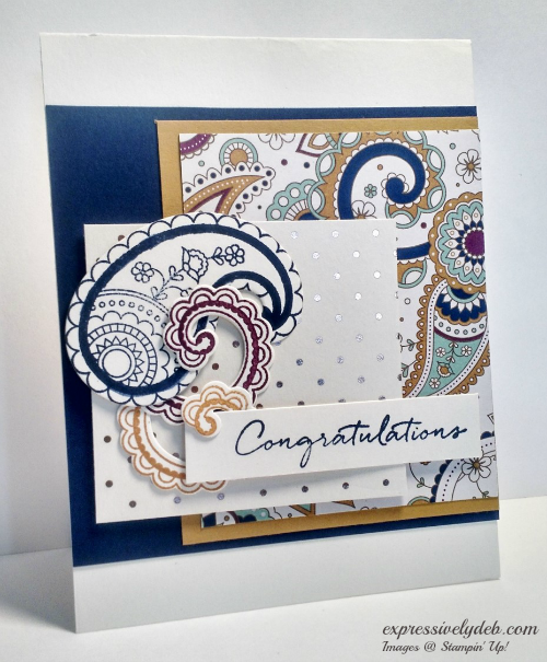
The first item on my Wish List from the Holiday Catalog was the Petals and Paisleys Product Suite… it’s just stunning, and paisley is very “in” right now.
The stamps, matching framelits and Specialty Designer Series Paper made it so easy to put this card together. Honestly, the hardest part for me was deciding which color combination to pull from the patterned paper. I’ve always been partial to the blues and yellows together so I went with Night of Navy and Delightful Dijon… I added a little Rich Razzelberry just for fun.

This was another project from my Stamp Club last week. Simple and easy… the Petals and Paisleys Specialty Designer Series Paper does the work for you.
- Start with a Very Vanilla card base – 4 1/4″ X 5 1/2″;
- Add a 4 1/4″ square of Night of Navy card stock as the first layer;
- The Delightful Dijon layer is 3 1/4″ X 4″ topped with a 3″ X 3 3/4″ layer of Petals and Paisleys.
- The “Focal Point” polka dot layer is 3″ X 2 1/4″ and is the backdrop for three stamped and cropped images from the Paisleys and Posies stamp set. The “Focal Point” layer also anchors the sentiment layer.
Design Tips:
- The “Focal Point” almost always involves your sentiment;
- The three elements on the focal point layer anchor the sentiment layer and give the left side of the design balance.
- I used the “Rule of Thirds” generously in this card… there are three base layers (Night of Navy, Delightful Dijon, Petals and Paisleys DSP) on the right of the design and three layers on the left (the polka dot DSP, the stamped images, and the sentiment). There are also three stamped elements anchoring the sentiment.
- I always enjoy taking a look at the different elements of a design, and have to admit that I don’t always realize I’m working with the “rules”. It’s more fun for me to just let it happen then take a look.
I hope you enjoy today’s post, so grab some beautiful patterned paper, crop a few images, add a layer or two and create something very pretty!

Paisleys & Posies Photopolymer Bundle (Stamp set and Framelits)
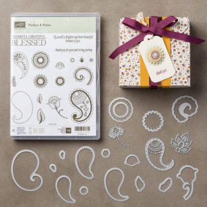
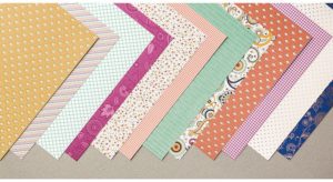
Petals & Paisleys Specialty Designer Series Paper
Click images below to get more information on current Stampin’ Up! Promotions.