Jan 19, 2021 | Design Tips, Fancy Folds, Gallery, Quick & Easy, Valentines |

Today’s post happens to be one of my favorite fun fold designs. It’s quick and easy and has a few layers. I love layers on a card.
Adding layers to a card accomplishes a few simple design techniques:
- Layers can emphasize and define your focal point. In my card today, the hearts steal the show!
- Layers can help with color balance. The side panel thin black layer helps the patterned paper pop and balances the black and white in the gingham heart.
- Layers give your card a little more weight and can add dimension without foam tape or dimensionals.

The Lots of Heart Bundle in Stampin’ Up!’s new January-June Mini Catalog was on my first wish list. Not just for Valentine’s Day, this Bundle can be used time and again and for quite a few different occasions. There’s one caveat… you have to get the Bundle.
My card base is Blushing Bride and the polka dot patterned paper is from the True Love Designer Series Paper pack. I thought about using a few Matte Black Dots to embellish my “Lots of Hearts”, but opted for an old favorite and now retired, Cherry Cobbler Candy Dots.
Here are the cutting dimensions for this card:
- The Blushing Bride card base is 4 1/4″ x 11″ and scored at 5 1/2″.
- Cut off 3″ from the left side of the card base after scoring. This piece will be your Fun Fold focal point front.
- Cut a Basic White layer 2 3/4″ x 4″. This layer is attached to the Blushing Bride focal point front.
- Cut a Basic White 4″ x 5 1/4″ layer for the inside sentiment layer.
- The patterned paper layer is 2 1/4″ x 4″.

I prepared this card project for my Team gathering this past weekend. Tomorrow, I’ll post each Team member’s project, along with simple to follow tutorials.
So, grab a few cropped hearts, add some candy dots and create a simple fun fold.
…the only limitation is your imagination!

You can click on each image below for the product details.
CLICK TO SHOP MY ONLINE STORE AT STAMPIN’ UP!

Jan 10, 2021 | Design Tips, Gallery, Thank You |

It’s Sunday and time for a color challenge over at the Paper Players. Ann chose Blackberry Bliss, Bumblebee and Misty Moonlight. These are three vibrant colors with lots of deep tones. They make a great combination.

For my inspiration card, I chose to go with Stampin’ Up!’s Garden Wishes Bundle.
My card is a simple A-2 white card base with a layer of Misty Moonlight which would serve as the backdrop for the rest of my design. I chose a subtle Bumblebee patterned paper from the Dandy Garden DSP stack. Not sure where to go from there, I took a look at the Dandy Wishes Dies and found my match. I die cut a white flower image that matched the pattern in the Designer Series Paper. Now I had a “pattern repeat” in my design so I knew the rest would be easy.

My only thought was to keep a good color balance. I had a good amount of Bumblebee and Misty Moonlight so I had to work on adding some Blackberry Bliss. The “Gallon-Quart-Pint” color design rule came to mind. Now that I had a “gallon” of Bumblebee and a “quart” of Misty Moonlight, I had to keep Blackberry Bliss to a “pint”.

I decided to practice my fussy cutting and hand cut the dragonfly image from some patterned paper. The little Blackberry Bliss die cut flower helped me balance the Blackberry Bliss as did stamping my sentiment in Blackberry Bliss.
So, grab some cardstock, add a few layers and a cropped image or two and join us over at the Paper Player’s Color Challenge this week. Be sure to take a look at the Design Team’s beautiful inspiration.

CLICK TO SHOP MY ONLINE STORE

Jan 8, 2021 | Design Tips, Gallery, Thinking of You |
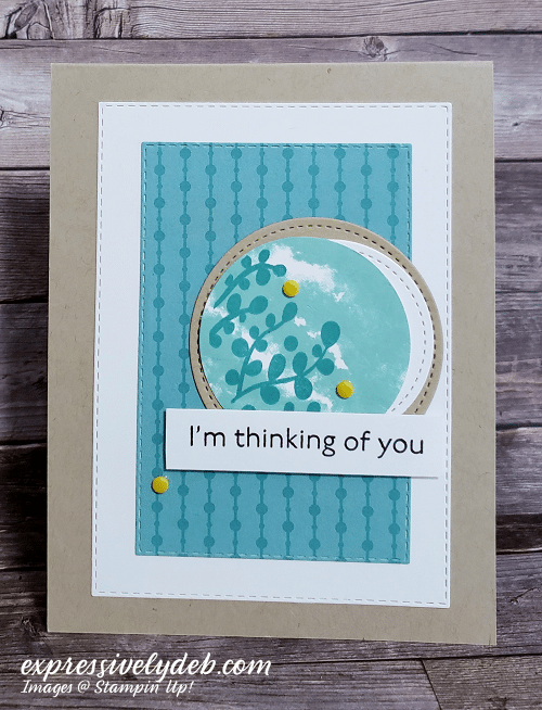
Today, I wanted to make a simple card and use more new Designer Series Paper.
Each year, Stampin’ Up! publishes a new Annual Catalog. In the catalog, they feature the 6″ x 6″ Paper Assortment to coordinate with each of their Color Collections. Today’s card features a Bermuda Bay circle pattern from the Brights Collection. The tone on tone patterns are great to have in your paper collection. They work well with the coordinating cardstock, ink and many of the featured Designer Series Paper packs. You can mix and match for any occasion. They are a good staple for your paper stash.
I was able to pre-order this DSP until January 4th. It will be available with the launch of the new Annual Catalog, but you can get it sooner if you join Stampin’ Up!. The Brights Collection is part of the five packs of FREE paper that you receive for signing up. Think about it. You can get all the details by clicking here.
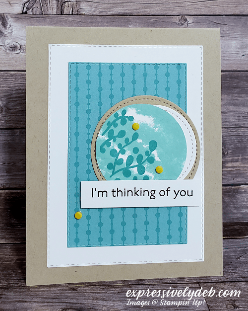
The Card Design
I kept this card design pretty simple so you can easily see the pattern in the paper. I stamped the top circle using the two step stamping technique. The “cloud” patterned base stamp is stamped with Coastal Cabana ink. The “branch sprig” stamp is stamped with Bermuda Bay ink directly over the cloud stamped image. I really am enjoying the Circles Celebration stamp set from the new January-June Mini Catalog. The stamp set coordinates with the Layering Circle Dies. You can purchase both and get one FREE Sale-A-Bration product.
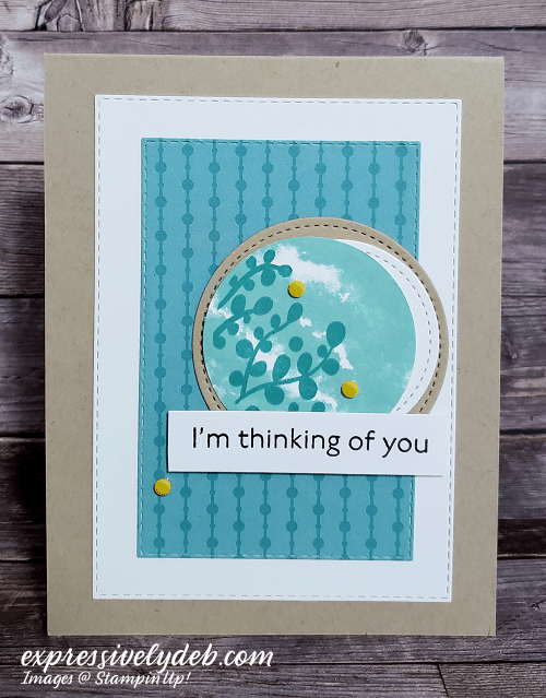
Design Tips
- The pattern in the stamped circle reminds me of the pattern in the DSP. Whenever I see a “pattern repeat”, I know the elements will always work well together.
- The die cut circles keep the circle pattern going.
- The circle and rectangle patterns repeat themselves in this design so I know all the elements I added will work well together.
- I embellished with a few Crushed Curry Resin Dots. When in doubt, add a little yellow.
- The sentiment font is clean and simple. It’s from the new Art Gallery stamp set which is truly stunning.
So, grab some simple patterned paper, repeat the pattern in your design, add a bit of yellow, keep the sentiment simple and create something thoughtful!
…the only limitation is your imagination!

THE JANUARY-JUNE MINI CATALOG IS HERE:
- Stampin’ Up!’s new January-June 2021 Mini Catalog is live!
- The new products are available through June 30, 2021.
- If you placed an order with me over the past year, you should have already received your catalog in the mail.
- If you haven’t received it, please email me and I will get a copy out to you.
- Below is a PDF download of the new catalog. Take a few minutes to download and save it. Have fun creating your new “Wish List”.

CLICK THE BUTTON BELOW TO DOWNLOAD A WISH LIST FORM

Sale-A-Bration – Here’s what you need to know.
- Sale-A-Bration is a huge SALE event!
- For every $50 in product purchases, you will receive a FREE Sale-A-Bration item.
- The FREE products are showcased in the Sale-A-Bration Brochure which you can download below.
- As you order, my shopping website will prompt you to add your Sale-A-Bration FREE product choice(s) so the process is very easy.
- Many of the Sale-A-Bration items coordinate with the new products in the Mini Catalog.
- If you’re not sure about which products they are, send me an email and I’d be happy to respond..
CLICK ON THE IMAGE BELOW TO DOWNLOAD THE SALE-A-BRATION BROCHURE

SHOP MY ONLINE STORE
Oct 15, 2020 | Birthday, Clean and Simple, Congratulations, Design Tips, Gallery, Masculine, Quick & Easy, Tutorials |

Happy Thursday! Wow, what a wonderful Blog Hop all of us Pals had yesterday. The comments were great and the talent was over the moon and the stars!!
Speaking of stars, I cropped lots of stars from the Stitched Stars Dies to create my card today. My inspiration came from a card I posted back in 2016. I was updating my Project Gallery and saw the card.
Out came the stars patterned paper from the Brightly Gleaming Specialty DSP. The patterned paper gave me my color inspiration: Night of Navy, Mossy Meadow and Very Vanilla, and the sentiment is from the Daisy Lane stamp set.
I added layers to this card because I really wanted to “lift” the patterned paper. A few thin mat layers will usually do that. Thin layers will also add a clean finished look to most card designs. There really is no particular pattern placement with the stars, I just kept both the colors and the elements in balance.

Design Tip:
- When I use the design term “balance” it simply means that the elements on the card are balanced to the frame.
- If you look at the bottom left Mossy Meadow star, it’s about the same distance from the bottom of the patterned paper layer as the Night of Navy star on the top left corner is from the top of the patterned paper layer.
- All of the left sided elements are placed roughly the same distance from the left edge of the patterned paper layer and the same goes for the elements on the right side of the design.
Pretty cool, right? It works every time!
Below is my card inspiration and you can click here or on the image below to see my original post.

So, get out your Brightly Gleaming Specialty DSP, add a few layers, crop lots of stars and create something that’s ready to shine!
The only limitation is your imagination!


We all love gorgeous Designer Series Paper, and during this incredible sale, you can enjoy a 15% discount on select papers from our current catalogs! Now is a great time to stock up and save on some of our most popular paper designs! There is no limit to how many you can order. You can click on the image above or click below to see the patterns on sale.
Sep 29, 2020 | Christmas, Clean and Simple, Design Tips, Gallery, Holidays |
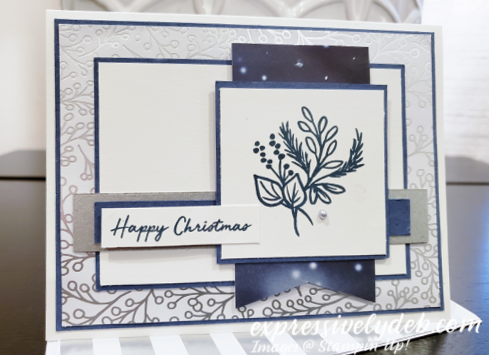
Let’s celebrate a Happy Christmas with The Paper Players!
Today is a first for me in a long time. I haven’t participated in a card making challenge in a few years, so I’m a little nervous about linking it up, what time do I post, etc. etc. Slowly but surely, I’m getting back in the blogging groove and truly enjoying it.
The Paper Players was always a favorite challenge. I “played” with them for quite a few years! When I checked in to see what the Design Team was up to, I saw there was a Sketch Challenge. Since getting back into the Challenges has been on my mind, I thought this was the week to do it and Joanne’s Sketch Challenge would be it!

Let’s talk about today’s card.
This is a fun sketch but it really has lots of layers. Joanne wasn’t kidding! Actually, I love layers so I enjoyed putting it all together.
Whenever I create a card for a sketch, I usually start with a stamped image. I think about what would work with the sketch. I mostly look at the size of the image and its line weight. I can usually decide my theme from there.
The stamped image today is from the Celebration Tidings stamp set and is one that I’ve used over and over again. I love the simplicity of it, the size and the line weight. The sentiment stamp is from the Warm Hugs stamp set. I also chose this sentiment because of its size and its font line weight worked nicely with the image. They are both clean, simple and slightly striking. The image needs no color. It can carry itself along with just one Silver Metallic Pearl. So, the top layers of my card were done before anything else.
My color inspiration, Misty Moonlight, Silver Metallic and Whisper White, was from a favorite photographed design from the Feels Like Frost DSP. I used this to cut and hand crop the wide banner. The silver and white patterned paper in the background is also from the Feels Like Frost DSP collection. I saw the “pattern repeat” in the stamped image and the patterned paper, so I knew they would work well together. Lots of tiny circles and curved lines in this card design.

In the end, all of Joanne’s layers work beautifully together. Since this was my first in a while, I took no artistic license with this sketch. Thank you, Joanne and The Paper Players Design Team for your inspiration today.
So, pull out your favorite stamped image, stamp it on a 2 3/4″ square, match a sentiment with it, cut lots of layers and create something simple and striking!
The only limitation is your imagination!

Click on each product below for a larger view and all the details.