Aug 5, 2021 | Design Tips, Fall Themed, Gallery, Stampin' Up! Specials & News, Thank You |

Happy Thursday
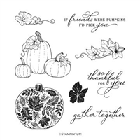
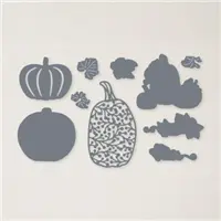
I designed today’s card from another favorite in the new Holiday Mini, the Pretty Pumpkins Bundle. These pumpkins are pretty, indeed and make it very easy to create pretty Fall themed projects. The Bundle includes the Pretty Pumpkin Stamp Set and the Detailed Pumpkin Dies. Purchase the Bundle and get a 10% discount.

Inspiration can come from anywhere. It’s always around us. Today’s card is inspired by a catalog ad I saw. When I saw this picture, Pretty Pumpkins came to my mind. It’s interesting how that happens.

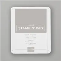
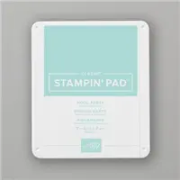
Rather than using a wood background, I used a textured patterned paper from the In Good Taste Designer Series Paper which is currently in the Annual Catalog. My card base is Gray Granite and I added a Pool Party cardstock layer under the patterned paper. The Gray Granite stamped pumpkin images are die cut with the matching die. The bottom leaf cluster is stamped with Mossy Meadow ink and die cut with the matching die.
A tip and a trick: I always use Thick Basic White cardstock for die cutting images when I can. The thicker cardstock gives you a sturdy die cut which will give more dimension to your finished project.

My Blends are fabulous for coloring, but my favorite coloring tools are a Blender Pen and ink. I used Gray Granite to outline the stamped lines of the pumpkins and shaded the leaves with Mossy Meadow ink and my Blender Pen. I couldn’t resist inking up the background DSP, so I inked up my Blending Brush and had a little fun with Pool Party ink.
Isn’t the sentiment font gorgeous? I stamped my thankful sentiment directly onto the DSP with Gray Granite ink. Thank goodness for my Stamparatus. I stamped the image more than once to get the sentiment a little darker than the pumpkins.
So, add Pretty Pumpkins to your Wish List, find some inspiration and create your special pretty pumpkins!
…the only limitation is your imagination!

THE NEW HOLIDAY MINI CATALOG
You can download the virtual Holiday Mini catalog by clicking here or on the image below.

SALE-A-BRATION
It’s also time to Sale-A-Brate. For every qualifying purchase from any of the current Stampin’ Up! catalogs, including registering for Paper Pumpkin, you can choose a FREE product from the brochure below. The Sale-A-Bration sales period runs through September 30th.

I WOULD LOVE TO HAVE YOU JOIN MY TEAM
This is a great time to become a Stampin’ Up! Demonstrator. Along with the Starter Kit which includes $125.00 in products you choose, you will receive a Bundle of your choice from the new Holiday Mini and FREE shipping all for $99.00. There’s no better time than during Sale-A-Bration to join. You can click here for all of the details or contact me directly. I would love to have you join my Team of fun and talented paper crafters. The Sale-A-Bration sales period runs through September 30th.
You can click on any of the images below for details on the products I used today.

Aug 3, 2021 | Christmas, Design Tips, Gallery, Holidays, Stampin' Up! Specials & News |

Happy Holidays!
It’s August 3rd and time to Sale-A-Brate the launch of this year’s Holiday Mini Catalog. Stampin’ Up!’s official title is the July – December 2021 Mini Catalog. I call it the “Holiday Mini” It’s packed with amazing seasonal projects for your inspiration. All of the products are designed so you can craft, create and design your holiday projects with ease. You can download a PDF version by clicking here or on the Catalog image below.
Along with the new July=December 2021 Mini Catalog, it’s time for another Sale-A-Bration. You know what that means. For every qualifying purchase from the Mini Catalog, you will be able to order a Sale-A-Bration product FREE! You can click here or on the image below to download a PDF version of the Sale-A-Bration Brochure.
There’ve been Sneak Peeks, Product Previews and lots of samples displayed over the past few weeks. As a Demonstrator, I was able to pre-order and create with new, fun products.

Would you believe me if I told you I completed today’s card in about 5 minutes? Okay, I did have my cardstock, ink and the new Words of Cheer Bundle (page 20 in the Mini Catalog) ready and waiting for me.
Here’s How I Did It
- I cut a Mossy Meadow cardstock base 5 1/2″ x 8 1/2″ and scored at 4 1/4″.
- The Basic White cardstock layer is 5 1/4″ x 4″.
- I stamped the large holiday floral and stem cluster with Mossy Meadow ink in the center of the white layer offsetting it slightly to the left.
- I stamped the “holidays” sentiment in Polished Pink.
- Design Tip: Take a look at the card above. You’ll see that the “s” in “holidays” is just about the same distance from the edge of the white layer on the right side as the pine bough is from the edge on the left side. Although the stamped pattern isn’t centered, my design is still “balanced”.
- I die cut “happy” and its matching shadow using Polished Pink and Thick Basic White cardstock.
- Design Tip: Using Thick Basic White cardstock to die cut words and more intricate patterns gives the die cut more dimension.
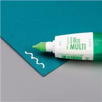
- I applied a very thin line of Multipurpose glue to the Polished Pink shadow die and centered the Basic White die on it.
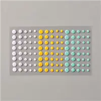
- I enjoy adding a bit of an embellishment. The Gold Metallic Pearls worked perfectly for me.
Here are the Catalog Details
- The August – December Mini Catalog purchase period runs from August 3, 2021 through January 3, 2022;
- The Sale-A-Bration FREE qualifying product sales period runs from August 3, 2021 through September 30, 2021
Have fun looking through the new catalog . Remember…
…the only limitation is your imagination!
Click to shop my online store at Stampin’ Up!
Jun 16, 2021 | Clean and Simple, Design Tips, Gallery, Thinking of You |
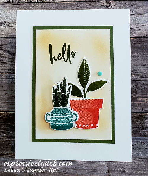
Hello stamping friends and happy Wednesday! I can’t believe it’s Wednesday. It’s refreshing to have beautiful, sunny weather after all of the recent rain we’ve had. The skies are an amazing blue. I haven’t seen that for almost a week!
Today’s post is a simple design. I decided to play with color and my Blending Brush. A few posts ago, I inked over a stencil with a sponge. After trying that technique and doing some blending today, I found that sponging is very different from blending.
I like the outcome of both. I noticed that blending the ink gives a softer, smoother result than sponging. The sponging took a little less concentration. The reason for that could be I used a stencil.
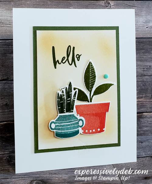
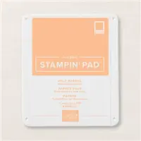
I blended Pale Papaya ink with very light pressure using my Blending Brush and applied the ink in a circular motion. When I sponged the ink, I also used a circular motion but applied more pressure to transfer the ink.
Let’s Talk Color
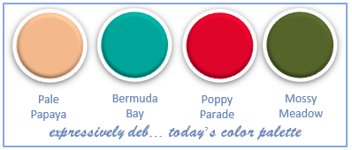
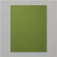
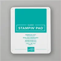
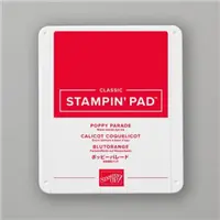
I thought Pale Papaya would give me a soft background for the bolder colors I chose. Pale Papaya has a lot of yellow in it and yellows are a good neutral. I always enjoy pairing blues and oranges. They’re “complementary” on the color wheel and look great together. Poppy Parade and Bermuda Bay were my choices today. My plants are Mossy Meadow, which is a favorite green for me. I like the way Mossy Meadow pairs with Pale Papaya.
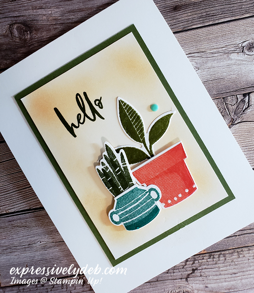
A Little Sidebar
The layer dimensions I used today fit perfectly on a 3 1/2″ x 5″ Note Card. The Mossy Meadow layer is 3″ x 4 1/4″ and the Basic White top layer is 2 3/4″ x 4″. My card is a standard A-2 top fold card.
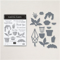
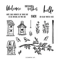
I used the Plentiful Plants Bundle today. The stamped images are from the Plentiful Plants stamp set. Look closely at the detail in the stamps. They are amazing! I die cut the stamped images with the matching Perfect Plants Dies. The sentiment is from the Garden Birdhouses stamp set… love the font!
So, if you haven’t already done it, treat yourself to the Plentiful Plants Bundle, add a Blending Brush and a fun color combination and create something just to say hello!
…the only limitation is your imagination!
For more details on the products I used today, you can click on the images below.
For your files, you can download, save or print a complete supply list for today’s project by clicking HERE.
Click to shop my online store at Stampin’ Up!
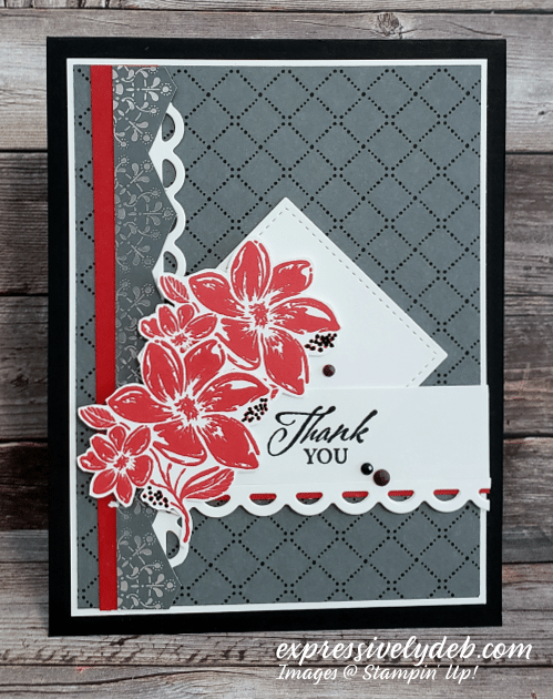
May 9, 2021 | Design Tips, Gallery, Thank You, The Paper Players |
Happy Mother’s Day to all our wonderful Moms!
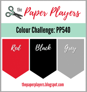
It’s Sunday and time for another Paper Players challenge. This week, Laurie is our host with a fun color challenge. Laurie’s favorite color combination is Gray, Black and Red. She’s sharing that with us to see what we create.
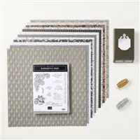
Today, I’m trying out some new products from Stampin’ Up!’s new annual catalog. My card is an “elegant” thank you with supplies from the new Simply Elegant Suite. The Elegantly Said stamp set has beautiful images and sentiments that are very elegant! The Simply Elegant Designer Series Paper is just that… simply elegant! I used both today. So, let’s get right to my card story.
I enjoy blog challenges. When my inspiration runs low, I always find something in a challenge to ignite it again. My finished project is the surprise that makes it fun.
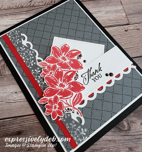
I enjoy making what I call “collage” cards. I layer and glue lots of elements to create a design. That’s what I did today. As I’m doing it, I get inspired. I add something and take away something, then add something more. Many of the design rules I’ve learned along the way help me decide what I’ll use.
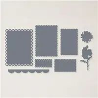
- I started with a Basic Black A-2 card base. It’s cut 11″ x 4 1/4″ and scored at 5 1/2″.
- The Basic White layer is 3 7/8″ x 5 1/8″ and the patterned paper layer is 3 3/4″ x 5″.
- These layer dimensions are my basic “go to” dimensions. They always help get me off to an easy start when I don’t know where to start.
- The simple and elegant patterned paper caught my eye. Perfect for today’s challenge, it’s Basic Gray and Black. All I had to do was add red.
- I stamped the flowers with Real Red ink and fussy cut them.
- I moved the flowers around the patterned paper layer quite a bit until I realized they needed some sort of an anchor.
- The vertical strips worked well. I had a Real Red scrap that was already cut 1/2″ x 5″. I layered patterned paper on top of it. If you look closely, you can see I cut the patterned paper to create a “pattern repeat” with the background layer. The pattern in this strip of paper somewhat mimics the flowers.
- The scalloped edge lifted the patterned paper and real red anchor because it’s white. I also created another pattern repeat – the scallop edging and the curvy lines of the flowers.
- I needed more white, so I die cut a Stitched Square and layered it under the flowers. The square created another pattern repeat!
- The sentiment layer was just a repeat of the vertical layer, bringing more red toward the right side of the card (color balance). At the last minute I added the scalloped edge to the sentiment layer.
Try creating designs with pattern repeats. It works and it’s fun!
I added some flowers to the inside of the card. The detail in the stamped image is beautiful.
So, pull out all your grays, blacks and reds, create some pattern repeats and link up with us over at the Paper Players. We really enjoy seeing all of your beautiful creations. For more inspiration, check in on the rest of the Design Team.
…the only limitation is your imagination!
The Paper Players Design Team
For more product details, you can click on the images below.
Jan 24, 2021 | Congratulations, Design Tips, Gallery, Quick & Easy, The Paper Players |

It’s Sunday and time for another Paper Players challenge. This week, Joanne created a simple and fun sketch for our inspiration.

So, let’s get right to my card today. Joanne gave us a lot of artistic license with her sketch. It’s simple with a single layer and sentiment banner.

I decided to open up my In Bloom Bundle and have a little fun. I matched the Bundle with the Paper Blooms Designer Series Paper which work perfectly together.
The patterned paper was the inspiration for my stitched floral die cuts and color palette and I added a little So Saffron to the center of my stitched flowers.
I followed the design “rule of thirds” using three die cut flowers to anchor the sentiment banner. Although the elements in this card design are simple, the Night of Navy and Basic White patterned paper makes a bold statement. I thought it best not to use any embellishments. Sometimes less is more. I also created a pattern repeat between the stitched flowers and patterned paper. Whenever you have a pattern repeat, the elements will always work together.
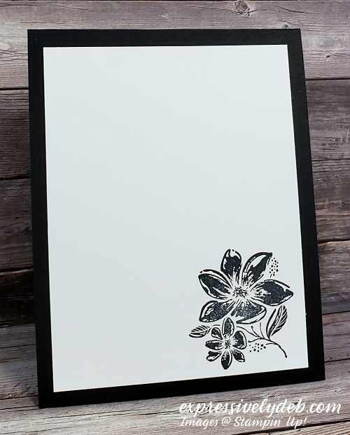
I absolutely love the sentiment font. Stamped with Night of Navy ink, the swirly letters and heavier line weight of the sentiment stamp are strong enough for the patterned paper background.
So, grab some statement making patterned paper, add a few stitched flowers and a bold sentiment and create something amazing to link up with us over at the Paper Players.
…the only limitation is your imagination!

Be sure to stop by and say hello to The Paper Players Design Team:
They all have plenty of incredible inspiration to share.
You can click on each image below for product details.
SHOP MY ONLINE STORE AT STAMPIN’ UP!