This card is all about color, texture, sparkle… and Stampin' Up!'s newest Photopolymer Stamp Set, "Banner Blessings". I really enjoy working with the pohotopolymer stamps; they're so clear, you can see where you're stamping, and they stick to the clear blocks like magic!
So, let's get right to the color, texture and sparkle…
Color – I love to play with color. Like you all, I have my favorites, but when I come up with a new color combination that works, I'm excited. Bermuda Bay, Crushed Curry and Cherry Cobbler "work". They are all deep hues with lots of warmth, yes even Bermuda Bay… it's a "warm" blue, so pair it with the warm shades… the warm yellows, browns, reds and greens… I bet it'll look great with Pistachio Pudding, a "warm" green!
Texture – To have texture, you don't always have to use your embossing folder. Texture can be created with pattern and dimension which is what I did here using some patterned paper and square frames.
Sparkle – Ah yes… one simple sequin and a Silver Glimmer Paper cropped star. That's all it takes, but do you notice that the "sparkle" in the Silver Glimmer Star brings out the "sparkle" in the patterned paper layer? I didn't realize it until I took the picture.
So, pull out your framelits, add some sparkle and create something magical that will "shine like the stars in the Universe"!
It's Thursday and another Pals Paper Arts Color Challenge. Love these colors! … Mossy Meadow, Cajun Craze and Soft Suede… CLASSY!
Been thinking about this Challenge for a few days. One of the perks of being part of the "Pals" is that I'm able to see the upcoming Challenge before it goes live. When I first saw these colors I knew exactly how I wanted to present them… by using one of my favorite sketches. Sometimes it just happens, the sketch and colors fit like a "hand in a glove"! So, this one happened to be easy for me… I went with my instinct and enjoyed every step.
Here's a little "Design Tip"…when you're using a three-color combination, always keep the "Gallon, Quart, Pint" Rule in mind. One color should be your predominant color (your "Gallon"); one will be there, but not take over (your "Quart"), and one will be your accent – just a little (your "Pint").
So in this design, Soft Suede is my "Gallon", Cajun Craze is my "Quart", and Mossy Meadow is my "Pint".
Soft Suede and Cajun Craze are pretty close, but the difference is I framed the design with Soft Suede, so it's the front runner.
It's fun to see it all work as it should.
So, pull out your favorite sketch, use these gorgeous colors and create something classy!
No challenges, Fall themed, or Holiday card today… I just wanted to create something a little different. I had the Stars Framlits on my stamping table from yesterday's post, so they became my inspiration for today's theme.
The "Confetti Celebration" Designer Series Paper was my color inspiration and I am so happy with my choice. The bold, deep colors just pop against the Basic Gray card base.
"When in doubt, go with yellow"… I know I've said that before, so I pulled the Crushed Curry out of the patterned paper to be my contrast to the Basic Gray. It was a hard choice since any of the colors would have worked beautifully with this card design and the Basic Gray background. The Silver Glitter Stars give this very simple design a little sparkle and the sentiment is bold enough to stand up against the patterned paper.
I used my 1/2" circle punch to "embellish" the tag and attached the stars with a few Dimensionals for a little depth and interest.
Here are the design measurements:
Standard A-2 card base (4 1/2" X 5 1/4");
The center horizontal panel is 3 3/4" X 4 1/4";
The tag measures 4 1/4" X 2 1/4";
The cropped sentiment banner is 1" X 3 1/2'.
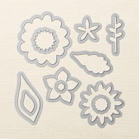
Choose your circle and star size from the Framelits to get the look you want.
This design will come together for you in no time at all, I promise.
So grab your framelits, some patterned paper, a bold sentiment and create something jazzy!
Stampin' Up! Supplies Used:Cardstock – Basic Gray, Crushed Curry, Silver Glitter Paper and Confetti Celebration DSP. Ink – Basic Gray. Stamp Set – Pictogram Punches. Tools – Circles Collection Framelits, Stars Framelit Dies, 1/2" Circle Punch, Stampin' Dimensionals.
Today, over at The Paper Players, Nance is challenging us with a super simple Sketch Challenge.
My inspiration today came from the "Nordic Noel" Designer Series Paper. There's lots of bright, bold patterns using the traditional holiday red and green with a little twist of Soft Suede (a warm brown) and Soft Sky (a beautiful soft, warm blue) along with Calypso Coral (a rich, soft orange).
It was so easy to stamp the little wreaths on the houses… the stamp is from the "Holiday Home" stamp set which is photopolymer… totally clear and when mounted on the clear block you're able to place the image perfectly.
"Merry Christmas" is from the "Endless Wishes" stamp set… how pretty is that font?
Here's a little design tip for you… The button on the card is one of the white buttons from the "Nordic Designer Buttons" collection. The button was too white against my Whisper White banner, so I punched out a 1/2" circle using the striped patterned paper and attached it to the button with a Stampin' Dimensional which was the perfect size to fit into the recessed portion of the button. The patterned circle sits beautifully on the button.
So, grab some patterned paper, add a sentiment and a custom button and create something wonderful!
Once again, I'm playing with The Paper Players. Sandy came up with a One Layer Valentine for this week's Challenge theme. These one layer cards really do challenge me. Anyway, this one's on its way over to The Paper Players.
I really enjoyed "masking" for this card. Haven't done that in quite a while.
Just stamp the sentiment onto a sticky note and fussy cut around the edges;
Then stamp the sentiment onto your card base and place the sticky note cut image over your card base image matching it exactly;
Stamp the heart image over the sticky note image;
Remove the sticky note sentiment from the card;
The sticky note protected the card image and it looks like the image is embedded into the heart.
Pop on a Rhinestone Basic Jewel for some balance and you're done.
Easy, fun and a pretty result!
I wanted to give this card serene simplicity. The sentiment says it all so there's not much else to talk about.
So, pull out your stamps and some sticky notes and "mask" something wonderful!
Stampin' Up! Supplies Used: Card Stock – Whisper White. Ink – Strawberry Slush and Jet Black Staz On. Stamp Sets – Hearts A Flutter and One In A Million.
Oh… on Saturday, I received some great news from The Paper Players. My card design for LeAnne's Color Challenge was chosen "A Cut Above". Thank you, Jaydee, for choosing my card. It's always fun to play with you all.
I am Debbie Crowley and welcome to my blog. Here you'll find fun projects that are sure to inspire you. I hope you'll stop
by often and leave a comment or two. To contact me, you can email me at: expressivelydeb@gmail.com
Current Catalogs
What are you looking for?
The content of this blog is the sole responsibility of Debra Crowley, expressively deb.com, as an Independent Stampin' Up! Demonstrator. The use of and content of classes, services or products offered is not endorsed by Stampin' Up!


![6a017744af3aa5970d01bb07b0b0ec970d-500wi[1]](https://expressivelydeb.com/wp-content/uploads/2014/11/6a017744af3aa5970d01b7c70d054e970b.png "6a017744af3aa5970d01bb07b0b0ec970d-500wi[1]")


![Pp219[1]](https://expressivelydeb.com/wp-content/uploads/2014/10/6a017744af3aa5970d01b7c6fac554970b.jpg "Pp219[1]")


![Pp179[1]](https://expressivelydeb.com/wp-content/uploads/2014/01/6a017744af3aa5970d01a5113cd9e0970c.jpg "Pp179[1]")

![Cut+Above+Badge[1]](https://expressivelydeb.com/wp-content/uploads/2014/01/6a017744af3aa5970d01a5113ce4ae970c.png "Cut+Above+Badge[1]")