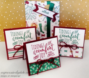
I always have fun creating 3′ X 3″ note cards. What a nice little “thank you” gift for holiday giving! And, I’m using the same Product Suite of supplies I used in my last post. It’s true that just a little can go a long way!
Assembling these little cards is so easy. You can make a bunch, group them in threes or fours, package them up and give them to anyone to express appreciation, keeping with the holiday “giving” season. They’re nice to give now so they can be used as holiday gift cards. How about making a bunch and giving them to your family and friends at Thanksgiving!
So simple and quick:
Cut your card stock card base 6″ X 3″ and score at 3″;
Pick out your favorite stamp and coordinate it with your favorite patterned paper. Here, I used the “Christmas Pines” stamp set, along with the Presents & Pinecones Designer Series Paper.
Crop your card layer (here I used Whisper White), to a 2 3/4″ square;
Add a 1″ X 2 3/4″ slice of patterned paper to the bottom of the card layer;
Stamp your image onto the top Whisper White part of the card layer;
For a little embellishment, I wrapper the card layer with some Cherry Cobbler Thick Baker’s Twine.
Inside each card, I added a 2 3/4″ Whisper White layer.
That’s it. You can make a bunch very quickly.
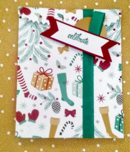
Now for the packaging – oh so easy using a coordinating piece of DSP, the Mini Treat Bag Thinlits, and your Big Shot. Three or four note cards and envelopes fit perfectly inside.
I used the 3/8″ Silky Taffeta Ribbon in Emerald Envy to close up my mini treat bag, and created a little sentiment tag and embellishment with my 1 3/4″ circle punch, a 4″ piece of ribbon and I hand cropped the Cherry Cobbler and Whisper White banners for the “celebrate” sentiment.
Quick, Easy and a sweet, thoughtful gift to give someone.
So, grab some card stock, a pretty piece of patterned paper, your favorite sentiment – add a pretty bag and create a pretty gift for your special Thanksgiving thank-you!
Check back tomorrow for a Sneak Peek from the up-coming Occasions Catalog.
Each year for the Holidays, I make a bunch of note cards. I usually put them on gifts with a handwritten note inside; I've grouped them in sets of four with a ribbon around them and given this little "gift" to friends and family during the Thanksgiving Holiday. I've also boxed them to give as gifts.
So, this is my first set of Holiday note cards for 2014, stamped with the "Festival of Trees" stamp set. The trees are all different, but they all have a shiny sequin star!
Each finished note card is a 3" square with a matching lined envelope. It's all in the details!
The Real Red 3/6" Satin Woven Ribbon is simply stunning. Its softness makes is so easy to tie a neat bow.
So, grab a Holiday stamp set, crop some 3" cards and create something stunning!
Don't you just love this little guy? I think he's cute as cute can be. I love his smile and his casual hello.
I created this card around this stamp. Today, I was compelled to ink it up. He's from the Fun With Christmas stamp set which is in the Holiday Catalog. The images are small, but adorable and you really can have fun with them.
This is a 3 3/4" square note card with a 4" square matching envelope.
It'll make a great little note card to attach to a special gift.
The design is simple and definitely Quick & Easy.
So let's use this card to review a few Card Design Tips from my posts earlier this week…
Not a whole lot of color to talk about here. Cherry Cobbler is a rich, deep, warm red. I stamped the little guy with Chocolate Chip just because it's a little warmer of a neutral than the black and although bold, I wanted to keep the look soft and relaxed.
My focal point, sentiment banner, and embellishment are all in my "Sweet Spot". I wanted to draw attention to the cluster of elements, but because my snowman is flanked by the darker tones, your eye will single him out.
My card design is balanced asymmetrically. Definitely a more whimsical layout. I do have repitition with color and pattern, but there's a variety of elements. The Cherry Cobbler Chevron Ribbon anchors my elements and the smaller Cherry Cobbler circle seals the deal for color balance.
I'm glad it's Friday. It's been quite a busy week at work and I have a busy weekend planned putting the finishing touches on my new stamping room.
You all have a wonderful weekend and be sure to pull out your stamps and ink and create something beautiful!
I can't tell you how excited I am to be showcased on Mary Fish's Stampin' Pretty Blog today. Because this is so special to me, I wanted to make today's post special.
I didn't start with a picture as I normally do because today is the beginning of a series of posts throughout this week that I'll be both talking about and illustrating some basic card design tips. There are not one, not two, but four cards for you today, so sit back and I hope you enjoy.
The Neutral
Let's get right to it. Today is all about creating with color, however my showcased card really has no color and yet contains every color imaginable. I'm not getting nutty or anything like that. It's a fact! White is the absence of all color and Black contains all color.
Black, white, gray and brown are all neutral colors and work with anything, so this card is Neutral and the colors convey a neutral mood. It can be masculine or feminine. No real statement or a big statement. It's mysterious (black) and simple (white).
What if I took away the black circle in the bottom right corner and replaced it with a bright Yellow circle… changed nothing else, but added the Yellow. Wow! The entire mood of the card would change. It wouldn't be neutral any longer. It would convey a totally different message… possibly bolder and friendlier.
WHEN IN DOUBT, ADD YELLOW… IT WILL ALWAYS WORK WELL AS AN ACCENT COLOR…
So let's try taking the same card, the same layout, the same sentiment, the same embellishments and LET'S CHANGE ONLY THE COLORS…It'll change the mood and the subjective message of the card. Play along, it's fun!
Pay attention to how you feel when you look at the different color combinations. I would love to hear your thoughts.
The Subtle (Soft)
This card features Stampin' Up!'s "Subtle" color pallette – Wild Wasabi, Pink Pirouette and So Saffron. This card is friendly, sweet, feminine, calming and simple (lots of white space). So Saffron (yellow) is the accent color. The message conveyed here is very different from the neutral card above, but the design is identical. The color changes the mood and message.
The Bright (Bold)
This card features Stampin' Up!'s "Brights" color pallette – Rich Razzleberry, Bermuda Bay and Daffodil Delight. This one's fun, cheery, friendly, more feminine than masculine, but could be either, and simple (lots of white space). Daffodil Delight (Yellow) is the accent color. A very different message and mood in this card than in the one above. Did your mood change a little?
The Regal (Rich)
And finally, Stampin' Up!'s "Regals" color pallette – Night of Navy, Island Indigo and Crushed Curry. This one has impact. It's cheery, and vibrant; more masculine than feminine, but could be both. The color intensity is high, creating a depth and richness, but it's relaxed and simple (lots of white space). Crushed Curry (Yellow) is the accent color. What are you feeling with this one?
Color is a real science and there's tons of information on the subject. One blog post a day for a year wouldn't tell us everything about color. Color is also very subjective and personal. We all have our favorites.
Understanding some basic color principles can help us all make good color decisions for our cards and projects.
Stampin' Up! has done most of that for us and given us beautiful color pallettes to work with that suit every mood and event.
Each of Stampin' Up!'s color suites is designed to coordinate perfectly with each other. For example for a "subtle" card – any of the colors in the Subtles Collection would work well with any other color in the Subtles Collection plus a neutral and possibly a "yellow" accent. Remember…yellow isn't necessary, but will always work.
So the formula for a perfect color combination is – A Subtle (or bright, or regal) with a Neutral plus an accent will always be a winner, or…
Two Subtles (or brights, or regals) with a Neutral plus an accent will always be a winner.
and with Neutrals…well, anything's possible!
For even more color fun, inspiration, and information, try working with Stampin' Up!'s Color Coach. I use it often and am always pleased with the result.
It's been quite a stampin' week… and still thinking about our Atlanta gathering… the Pals Blog Hop with Blog Candy, a new Pals Paper Arts Color Challenge and having some October fun with my stampin' group.
Here's one of the cards we made. This was a CASE from Stampin' Up!'s blog…gorgeous colors, Basic Gray and Crisp Cantaloupe. The group loved this one.
…and here's our second project. I CASED this from Pal, Pam Morris. Pam gave a similar gift to all of us who attended our Pals Atlanta gathering. Thank you, Pam, we loved this project. The bags are in Stampin' Up!'s Annual Catalog and that Silver Glimmer Paper is absolutely stunning!
Inside is a set of four 3 X 5 note cards with envelopes. So here's what we did…
We played "Chopped Challenge" at our Stamp Camp. For any of you who don't know what that is, check it out here, and thank you again, Brian King!
Yep, I put a bunch of stamps, inks and embellishments on the table, gave them their blank note cards and said…"CREATE"!!!
It was FUN! FUN! FUN!
Below is another version of the bag's tag (Pumpkin Pie Ribbon) which, by the way, I think is outstanding…thank you again, Pam Morris!
The mood last night was definitely one of giving. I announced my Blog Candy Winner yesterday morning and had some Stampin' Up! Halloween goodies for my group. (I usually give them all a little something at the end, but yesterday was a little more special). Well, I didn't say a word to anyone about my surprise, and wouldn't you know it… each one of the gang brought something for everyone. It was like Christmas in October!
Once again, I want to showcase Georgia Egan's work… she's also a Pal and a very talented paper crafter. Georgia loves to create and design gifts. She made this little goodie box for each one of us and filled it with chocolates…
I must say, I have a very special group of ladies. We decided that our November Stamp Camp will be all Christmas, and the consensus is that we do a little Iris Folding…a truly beautiful art. I'll be sure and post our projects then…and I have no doubt, Santa will show up!
Thank you for stopping by today, and happy stampin' to you!
I am Debbie Crowley and welcome to my blog. Here you'll find fun projects that are sure to inspire you. I hope you'll stop
by often and leave a comment or two. To contact me, you can email me at: expressivelydeb@gmail.com
Current Catalogs
What are you looking for?
The content of this blog is the sole responsibility of Debra Crowley, expressively deb.com, as an Independent Stampin' Up! Demonstrator. The use of and content of classes, services or products offered is not endorsed by Stampin' Up!


![6a017744af3aa5970d019b007b855f970c-500wi[1]](https://expressivelydeb.com/wp-content/uploads/2013/11/6a017744af3aa5970d019b0085ed32970b.png "6a017744af3aa5970d019b007b855f970c-500wi[1]")


![6a017744af3aa5970d019b00413721970b-500wi[1]](https://expressivelydeb.com/wp-content/uploads/2013/10/6a017744af3aa5970d019b005a9086970c.png "6a017744af3aa5970d019b00413721970b-500wi[1]")


![6a017744af3aa5970d019affecae9d970b-500wi[1]](https://expressivelydeb.com/wp-content/uploads/2013/10/6a017744af3aa5970d019afff9e74f970c.png "6a017744af3aa5970d019affecae9d970b-500wi[1]")